O-SPORTS
/BRANDING/
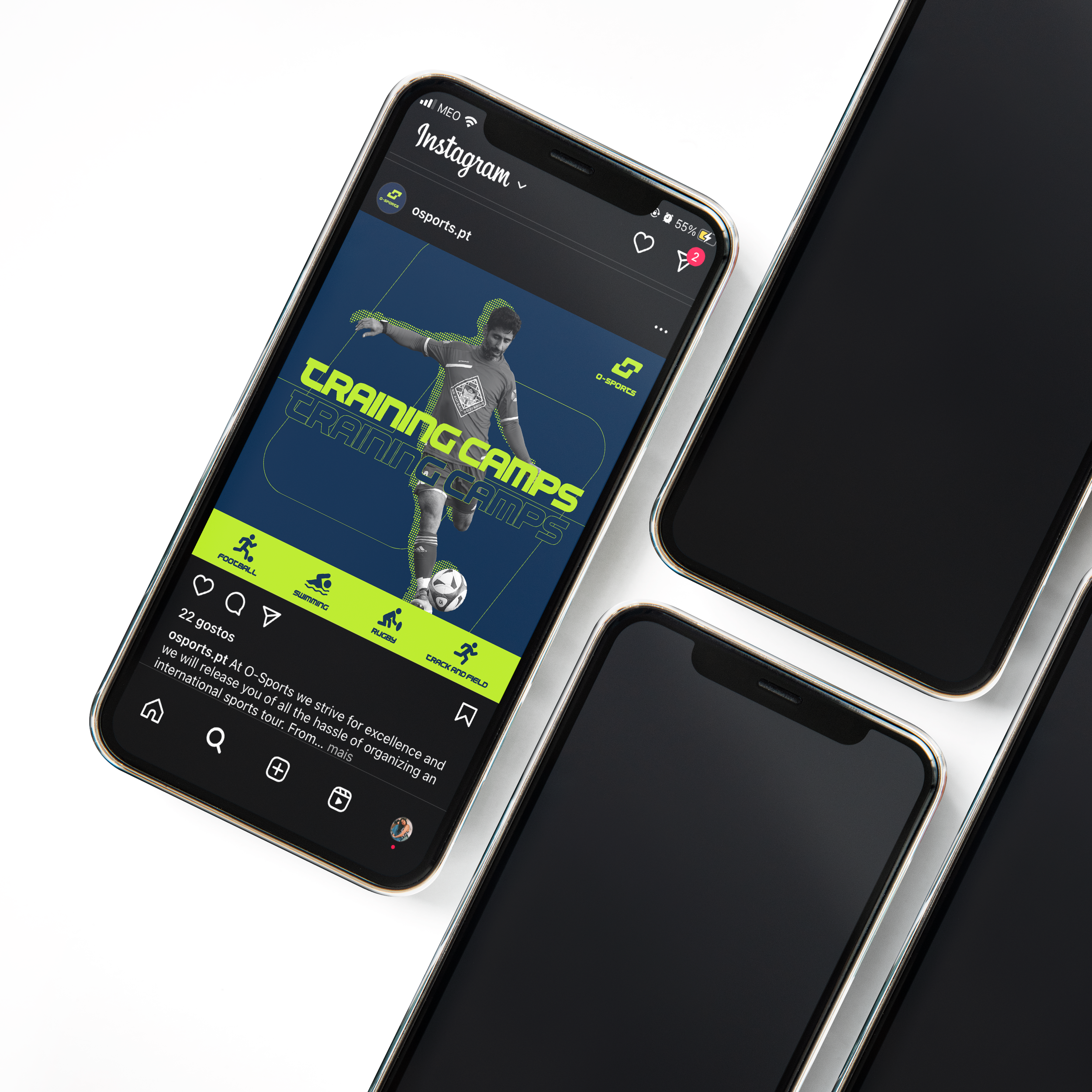
Development of logo and identity for the sporting event’s agency O-Sports.
The client intended a certain similarity with its competitors, at the same time the desire of standing out was undoubtable. With the pilars of innovation and movement in its core, this brand’s identity aimed to reflect the same.
The deconstruction of the initial of the brand’s name (the letter ‘O’ — a focus point for the company) allowed the transmission of this message and the personalization of the brand. The applications of the identity allowed the necessary reinforcement.
2022
*PROFESSIONAL PROJECT


